The sidebar: Quiet navigation for serious work
Most software treats the sidebar like spare storage. More buttons. More tabs. More clutter. But when your work involves client rooms, sensitive files, direct conversations, and pending decisions, navigation should do the opposite. It should reduce noise.
We designed the Qaxa sidebar to stay quiet. One place to see what changed, where work is moving, and what needs your attention next.
Navigation as noise
Most tools scatter your work across separate sections. Projects in one place. Messages in another. Notifications somewhere else. Files buried behind another switch. You spend more time moving between views than moving the work forward.
That kind of design does not support focus. It breaks it.
The Qaxa sidebar
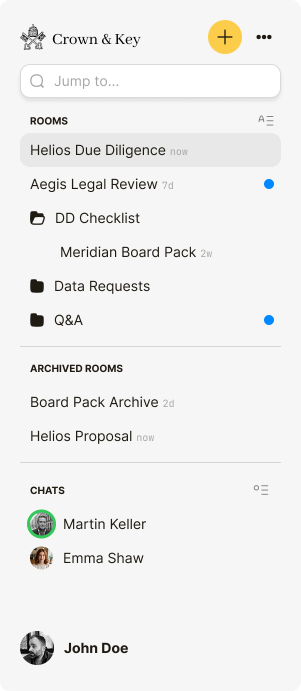
Qaxa keeps your working context in one view. Your rooms. Your direct lines. Your one-to-one chats. Your structure. No extra tabs to manage. No clutter competing for attention. Just a clear way to see what matters and move.
One glance tells you what changed 🔵. One click takes you there.
How it works
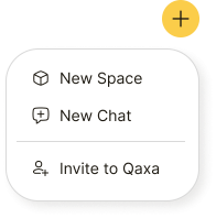
The action button
Create a room, start a chat, or invite someone. The next step is always close at hand.
Search
Search is fast and private. As you type, Qaxa filters results locally on your device, so your search stays responsive without exposing your data.

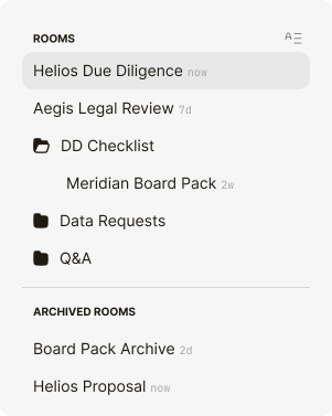
Your rooms
Everything you created or joined lives in one list. New activity is visible at a glance. You can group rooms into folders to keep client work, and internal work clearly separated.
Direct lines
Your private one-to-one chats with specific people stay close at hand. Open a conversation instantly, without leaving your current context.

The result
The sidebar gives you clarity without clutter. You always know where work is moving, what changed, and where to respond next. It does not compete for your attention. It helps you direct it.


